
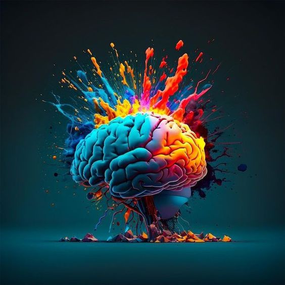
Color is a powerful tool in design, capable of evoking emotions, influencing decisions, and communicating messages without a single word. Understanding the psychology behind color can transform a design from mundane to impactful, ensuring that it resonates with the intended audience. This article delves into the principles of color psychology and offers practical tips on how to effectively use color in design to evoke emotions and influence decisions.
The Basics of Color Psychology
Color psychology is the study of how colors affect perceptions and behaviors. Different colors can evoke specific emotions and reactions, which can vary based on cultural contexts and personal experiences. However, certain generalizations about color effects are widely accepted:
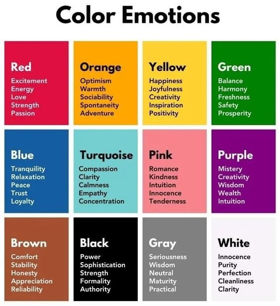
- Red: Often associated with energy, passion, and urgency, red can stimulate excitement and draw attention. It is commonly used in call-to-action buttons and clearance sales to provoke immediate responses.
- Blue: Known for its calming and trustworthy qualities, blue is frequently used in corporate designs and social media platforms. It can instill a sense of security and reliability.
- Green: Symbolizing nature, growth, and health, green is ideal for brands focused on wellness and sustainability. It can evoke feelings of tranquility and renewal.
- Yellow: Representing happiness, optimism, and warmth, yellow can capture attention and create a cheerful atmosphere. However, overuse can lead to feelings of anxiety.
- Black: Exuding elegance, sophistication, and power, black is often used in luxury brand designs. It can also convey authority and professionalism.
- White: Associated with purity, simplicity, and cleanliness, white is commonly used in minimalist designs and to create a sense of space and openness.
Using Color to Evoke Emotions
To evoke the desired emotions in your audience, it’s crucial to understand the context and purpose of your design. Here are some strategies to consider:
- Define Your Brand Identity: Choose colors that align with your brand’s values and personality. For instance, a health and wellness brand might prioritize greens and blues, while a luxury brand might opt for black and gold.
- Consider Cultural Differences: Colors can have different meanings in different cultures. Research your target audience to ensure your color choices are culturally appropriate and effective.
- Create Contrast: Use contrasting colors to highlight important elements and guide the viewer’s attention. High contrast can evoke a sense of urgency, while low contrast can create a more relaxed feel.
- Balance and Harmony: Use complementary colors to create visual harmony and balance. A well-balanced color scheme can evoke positive emotions and make the design more aesthetically pleasing.
Influencing Decisions with Color
Color can significantly influence consumer behavior and decision-making processes. Here’s how to leverage color to guide user actions:
- Call-to-Action (CTA) Buttons: Use bold, attention-grabbing colors for CTA buttons to encourage clicks. Red, orange, and green are popular choices for their ability to stand out and prompt action.
- Navigation and Usability: Employ color to differentiate between interactive elements and static content. This enhances usability and helps users navigate the design more intuitively.
- Emotional Triggers: Utilize colors that align with the emotional triggers you want to activate. For example, use blue for trust and reliability on a financial services website or red for urgency on a flash sale page.
- Brand Consistency: Maintain consistent use of brand colors across all platforms and materials. This reinforces brand recognition and trust, making users more likely to engage and convert.
Case Studies in Color Psychology
- Coca-Cola: The iconic red of Coca-Cola is synonymous with excitement and energy, making it instantly recognizable and emotionally engaging.
- Facebook: The use of blue in Facebook’s design instills a sense of trust and dependability, key qualities for a social media platform where users share personal information.
- Whole Foods: The green branding of Whole Foods reflects its commitment to organic and natural products, resonating with health-conscious consumers.
Color psychology is a fundamental aspect of design that can profoundly impact how your audience perceives and interacts with your brand. By strategically using color to evoke emotions and influence decisions, designers can create more effective and engaging experiences. Whether you’re crafting a brand identity, designing a website, or creating marketing materials, understanding and applying the principles of color psychology can enhance your design’s impact and drive better results.
Experiment with color in your next design project. Consider the emotions you want to evoke and the actions you want to encourage. By harnessing the power of color psychology, you can create designs that are not only visually appealing but also emotionally compelling and behaviorally influential.