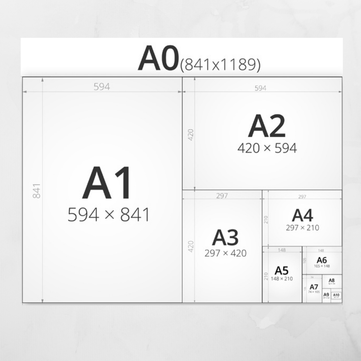
Creating a visually compelling design is both an art and a science. One of the critical aspects of this process is size formatting, which plays a significant role in how a design is perceived and experienced by the audience. Proper size formatting can evoke emotions, guide viewers’ attention, and convey messages powerfully and effectively. Here are some emotional and powerful tips for achieving design excellence through size formatting.
Understand the Emotional Impact of Size
Size has a profound psychological impact on viewers. Larger elements naturally draw more attention and can convey importance, urgency, or dominance. Conversely, smaller elements can indicate subtlety, delicacy, or secondary importance. By thoughtfully adjusting the size of various elements in your design, you can create a visual hierarchy that guides the viewer’s eye and evokes the desired emotional response. Understanding this impact helps you use size not just functionally but emotionally.
Create a Visual Hierarchy
A well-structured visual hierarchy ensures that viewers can quickly understand the key elements of your design. Use size variations to establish this hierarchy. Headlines and primary messages should be significantly larger than secondary text and details. This not only makes the design more aesthetically pleasing but also ensures that the most critical information is noticed first. A strong hierarchy enhances readability and emphasizes the core message of your design.
Balance and Proportion
Achieving balance in design involves ensuring that no single element overpowers the others unless intentionally done for emphasis. Proportional size differences between elements can create a harmonious and cohesive look. Balancing large and small elements within the layout helps maintain visual interest and prevents the design from feeling cluttered or overwhelming. Striking the right balance evokes a sense of calm and order, making the design more approachable.
Scale for Emphasis
Emphasizing particular elements through size can create powerful focal points in your design. If there is a specific message or call-to-action you want to highlight, making it larger than surrounding elements will draw attention to it immediately. This technique can evoke a sense of urgency or importance, compelling viewers to take action. Thoughtful use of scale for emphasis helps prioritize information and drives engagement.
Consider the Context
Size formatting should be adapted to the context in which the design will be viewed. For instance, designs meant for mobile devices require different size considerations compared to those for print or large screens. Text and key elements should be legible and impactful across various platforms and screen sizes. By considering the viewing context, you ensure that your design remains effective and emotionally resonant, regardless of where it is seen.
Whitespace Utilization
Whitespace, or negative space, is the area between design elements. Effective use of whitespace can enhance the impact of size formatting by giving elements room to breathe and stand out. Ample whitespace around larger elements can amplify their importance, while surrounding smaller elements with whitespace can prevent the design from feeling crowded. Whitespace contributes to a cleaner, more focused design, fostering an emotional sense of clarity and simplicity.
Typographic Size and Pairing
Typography is a crucial element in design, and its size significantly affects readability and emotional impact. Choose font sizes that are legible and appropriate for the message you want to convey. Pairing different font sizes effectively can create a dynamic and engaging visual flow. For instance, combining a large, bold headline with smaller, regular body text creates contrast and interest. Typography size and pairing should align with the overall tone and emotion of the design.
Consistency and Cohesion
While variation in size is essential for emphasis and hierarchy, maintaining consistency is equally important for a cohesive design. Establish a set of guidelines for different text sizes, margins, and padding to ensure uniformity across all design elements. Consistency in size formatting helps create a unified visual identity, making your design feel professional and well-thought-out. A cohesive design fosters trust and reliability, enhancing the emotional connection with the audience.
Experiment and Iterate
Design is an iterative process, and experimenting with different size formats can lead to unexpected and powerful results. Don’t be afraid to try various size combinations and layouts to see what resonates best. Gather feedback and refine your design based on how viewers respond to different size treatments. Experimentation allows you to discover new ways to evoke emotions and communicate more effectively through your design.
Achieving design excellence through size formatting requires a deep understanding of its emotional and visual impact. By creating a visual hierarchy, balancing elements, using scale for emphasis, considering context, utilizing whitespace, pairing typography thoughtfully, maintaining consistency, and experimenting boldly, you can craft designs that are not only aesthetically pleasing but also emotionally powerful. Size formatting is a potent tool in your design arsenal, capable of transforming how your audience perceives and interacts with your work. Embrace these tips to elevate your designs and leave a lasting, unforgettable impression.

